Glossary
Brand Identity Guidelines
- Color
Concerning the brand color:
Ready
[Base Environment Colors]
When displaying the Francfranc brand logo on various products, please select designs that respect the worldview of the brand logo, the product that carries the logo, and the materials.
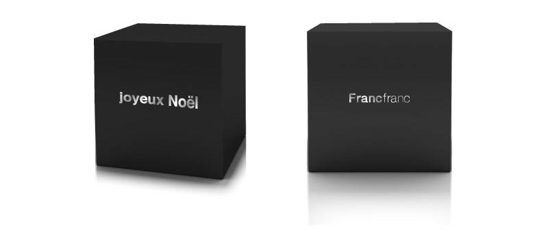
EX 1) For a black box with single-color embossing in silver, the principle color for spot-color printing is “silver”
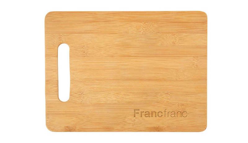
EX 2) For a wooden cutting board, the base color for that environment will be of the wood-grain texture, and by using a label (logo display) that makes use of the wood-grain, you can convey Francfranc’s identity without sacrificing that product’s uniqueness.
- Layout
About layout
Ready
[Communicating information without damaging the attractiveness of the brand]
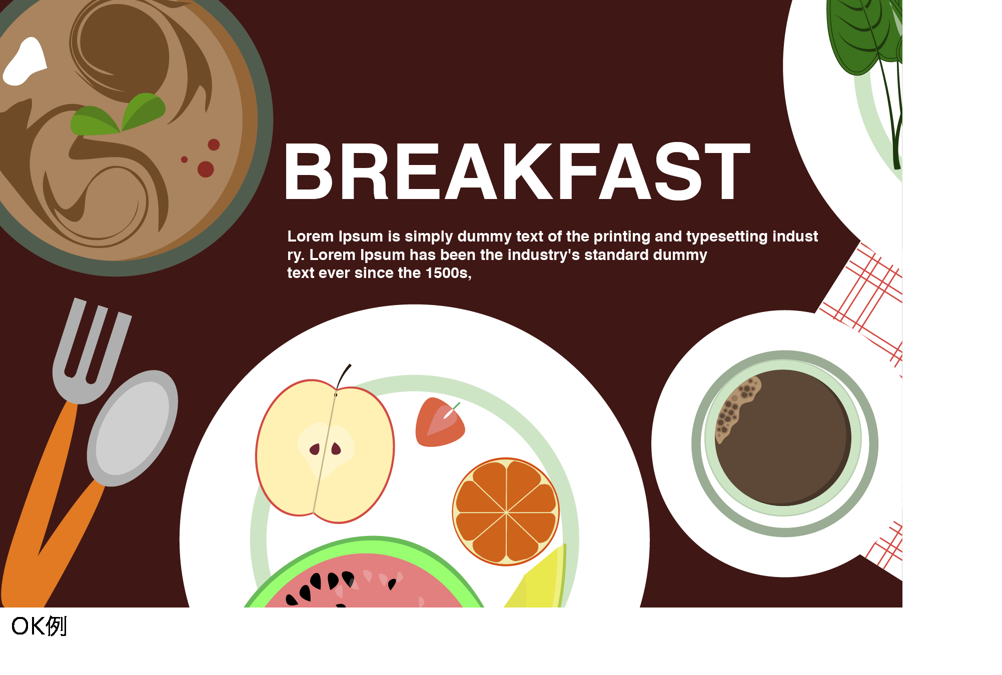
When using photos and text in the “Communication” design format to promote the brand and its products, pay attention to composition and the use of blank space to create a layout that is easy to read and look at.
Adding shadows to the text and placing photos thoughtlessly adversely affect visibility in visual communication and text content, so refrain from doing so.

- Photo direction
About direction in photographic expression
Ready
[Photos expressing the Francfranc brand image]
Advertising and product photos expressing the Francfranc brand image are to be ones taken by a professional photographer.
Lighting should be prepared to allow for clear expression of the characteristics of the brand and its products.
Use of photos in which the light source is distorted and the direction of the light cannot be specified, and photos with a blue shade taken under fluorescent light, is to be minimized.
Quality is to be emphasized with regard to both still photos and video, so avoid piecing together several horizontal videos on vertical signage, or using simple clips in which colored tiles are used to fill space.
When using a vertical format, shoot and edit media carefully to match the shape it is to be displayed in.

Design System Guidelines
- Identity
Represent the brand
Ready
[Typesetting with the Brand Font]
For a new series in the Francfranc brand or a tie-in with other brands, avoid the use of the Francfranc logo and display the Francfranc brand identity using typesetting with Francfranc’s brand font, Helvetica.
This is both out of consideration for the display of the tie-in partner brand’s name as well as to prevent any dissonance in balance through the use of the Francfranc logo or loss of legibility due to flaws in the typesetting.
- Design Elements
For Functional Design
Ready
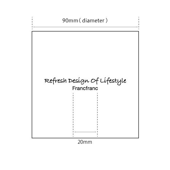
[Principles for the Display of One Identity Per Facet]
When presenting the Francfranc logo on a variety of packaging materials, emphasize suitable spacing and legibility while ensuring that only one logo or Identity is presented on any given display surface.
This is the presentation principle known in Francfranc’s design guidelines as “one identity per facet”.
For example, when collaborating with another brand on a tie-in for presentation, even with typesetting using the brand font, make sure to display only one logo per display face by redesigning the display as a single Identity.