
Essence of Basic Design
- Identity
Displaying the brand
Ready
[Logo / Symbol / Brand Identity]
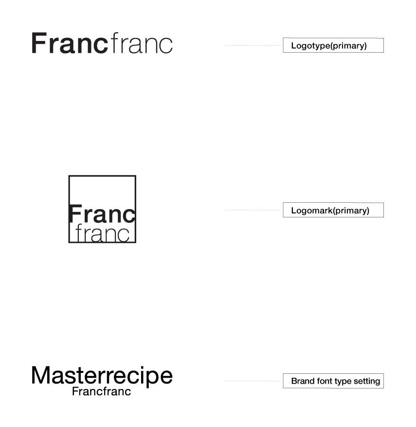
The identity of Francfranc is expressed through the use and arrangement of the logotype, logo marks, and brand font.
Francfranc's official logotype is a symbol of the brand and the most important, fundamental element of the brand’s DNA.
The position of the official logotype should be in the most appropriate space for the media in question, and whatever the situation, it should always maintain a consistent impression that does not devalue the brand’s products.
When using the logotype, always refer to these guidelines and consider whether the use is appropriate for the medium. Also consider whether the contractor in question has the rights to use the logotype, pay careful attention to the level of the design quality of the products, and make sure not to damage the image of the brand.
Ready
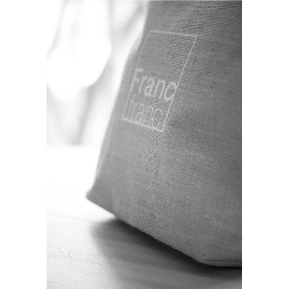
[Logotype / Isolation]
Displays that maintain the independence (isolation) of the logotype are crucial when making an impression with the brand image.
Even when being used in combination with taglines or URLs, make sure to display and arrange the logos having referred to the recommended combinations which, again, do not damage the brand image or the independence of the logo.
Please refer to the logo manual for details on the Francfranc logotype.

Ready
[Logotype / Prohibition]
Displays that maintain the independence (isolation) of the logotype are crucial when making an impression with the brand image.
Please avoid using shadows, changing the shape, adding borders, or adding unnecessary decorations to the logo. Please also stick strictly to the logo manual in order to preserve a unified image whatever the conditions, avoiding any use which might damage the correct balance or proportion of the logo.

- Typeface
Choose fonts that match the brand
Ready
[Brand Font / Alphabetic font]
Outside of the logotype and logo, the brand identity of Francfranc is displayed through typesetting with the brand fonts.
These were established in order to maintain familiarity with the latest version of the Francfranc logo. (As of 2017)

Ready
[Brand Font / Alphabetic font sample]
Francfranc products and designs incorporate various styles and trends. Helvetica, a timeless font and a favorite of designers across the world, fits our style and can be used for a wide variety of expressions.
When the main aim is to leave a strong impression of our brand image, including in a title or a new design series, we recommend Helvetica, which offers synergy benefits with the brand.

Ready
[Alternate Font / Alphabetic fonts for Windows]
We recommend Helvetica/Helvetica Neue, our brand font, as the alphabetical font to be used in all print materials and media that promote the Francfranc brand.
However, when using a Windows operating system that does not have any Helvetica fonts installed, use Arial instead.
Arial has been adopted as the standard substitute font for Helvetica by many brands and companies. It is designed for readability in the body of a text and has excellent visibility and versatility.

Ready
[Alternate alphabetic fonts when using Windows]
We recommend using Arial as a replacement on operating systems that do not have Helvetica/Helvetica Neue installed.
Arial Bold is used in the sample.
It resembles Helvetica and is an easy-to-read design, legible even in small sizes.

- Japanese Typeface
Choose fonts that match the brand
Ready
[Brand Font / Japanese language fonts]
We recommend Hiragino Kaku Gothic as the Japanese language font for Francfranc. This was set to maintain familiarity with the most recent Francfranc logo. (As of 2017)

Ready
[Brand Font / Japanese language fonts]
In print materials and all media promoting Francfranc brand information when using Windows, we recommend Meiryo as another option apart from the brand fonts, Hiragino Kaku Gothic and Hiragino UD Kaku Gothic.
The Japanese characters of Meiryo have excellent legibility, are designed to be readable in the main body of text, and adopt the standard, so called full-width design, of all Japanese typesetting.

- Brand Image
Value the brand image
Ready
[Snapshot]
Illustrative photographs used in all Francfranc media should be appropriate to the Francfranc brand image, which conveys keywords such as "high quality", "enjoyment", "comfort", and "freedom".
In particular, avoid the use of photographs that have a vague theme without a creative structure, or illustrative photographs without visual guidance that do not focus on the object.

Ready
[Landscape]
Illustrative landscape photographs used in all Francfranc media should set us apart from other brands, avoiding images with the feeling of other brands or ones that feel clumsy. They should evoke Francfranc brand concepts, including "an inspiring, high-quality lifestyle" and "stories that suit Francfranc".
In particular, avoid the use of photographs that have a vague theme without a creative structure, or illustrative photographs without visual guidance that do not focus on the object.
Ready
[Portrait]
Portrait photographs used in all Francfranc media should be photographs that give a sense of our brand identity. Keywords would be "reliability", "leadership", "good taste", and "charming figure".
In particular, avoid the use of photographs that have a vague theme without a creative structure, or illustrative photographs without visual guidance that do not focus on the object.

Ready
[Orientation]
In a diversifying media environment, with digital signage displays and responsive auto-trimming for multi-device support and social media, we recommend shooting both landscape and portrait versions when photographing key visuals in order to promote a unified image. (Consider that the image may be trimmed to square shape in the final version).
- Color palette (gold and silver)
Choose meaningful colors (when using gold and silver)
Ready
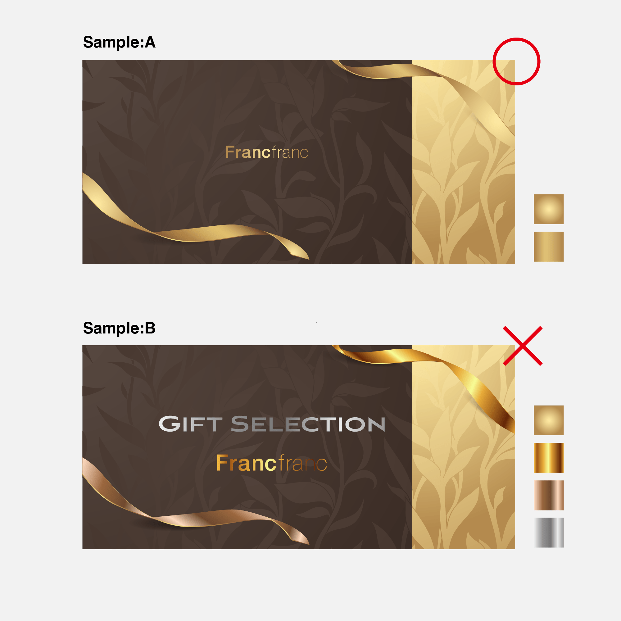
[Francfranc Gold / Francfranc Silver]
When expressing the Francfranc brand and its products with gold and silver, use refined spot colors (specified colors) appropriate for the brand in a uniform manner.
A vivid impression of abundance, quality, and style can be achieved through the use of gold.
Silver, on the other hand, can be used to communicate refined strength and a simple sense of high quality in a direct manner.
When managing the use of gold and silver, pay attention to the background color (the base color of the environment in question*) and trends, and always check with the design director and designer(s) whether use is appropriate for the Francfranc brand image.
Remember that a lack of uniformity in the use of gold and silver, with the colors jumbled together on a page, can lead to frivolous results.
- Brand Graphic Pattern
Extending the brand image with graphics
Ready
[About the use of graphics incorporating the logo as pattern]
We promote the use of graphics incorporating the logo (in the form of patterns) as a method of casually but firmly establishing the Francfranc brand image.
Simple, modern graphics combining regularity and irregularity heighten Francfranc’s brand value and originality.
Regarding use, the situation in question and the decisions of the design director and designer(s) shall take priority but, crucially, everything should always contribute to a sense of newness, fun, and an abundant lifestyle representative of Francfranc.
When logo-incorporating patterns can be replaced with other graphic patterns, use is not recommended under the design guidelines.