
Design System
Overview
- Guidance
The Francfranc Design System
Ready
[Purpose]
The purpose of the Francfranc Design System is to enable quick and accurate consensus-building when advocating innovative approaches, reducing the burden on staff and enhancing the value of the brand. The first edition was released in September 2017.
While serving the dual purposes of promoting the brand image and adding functional value in transmitting information, it also aims to efficiently realize a uniformity of quality and encourage the reduction of verification work for staff by producing commonly understood standards.
The Francfranc Design System will help the company evolve and expand while remaining flexible and in tune with changing markets and times. It should be the go-to reference when promoting the origins of the brand or its corporate philosophy.
We hope that staff and other related parties will respect the guidelines, make sound decisions, and produce designs that are both rich in creativity and suitable for the brand.
Essence of Basic Design
- Identity
Displaying the brand
Ready
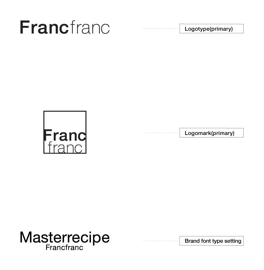
[Logo / Symbol / Brand Identity]
The identity of Francfranc is expressed through the use and arrangement of the logotype, logo marks, and brand font.
Francfranc's official logotype is a symbol of the brand and the most important, fundamental element of the brand’s DNA.
The position of the official logotype should be in the most appropriate space for the media in question, and whatever the situation, it should always maintain a consistent impression that does not devalue the brand’s products.
When using the logotype, always refer to these guidelines and consider whether the use is appropriate for the medium. Also consider whether the contractor in question has the rights to use the logotype, pay careful attention to the level of the design quality of the products, and make sure not to damage the image of the brand.
Ready
[Logotype / Isolation]
Displays that maintain the independence (isolation) of the logotype are crucial when making an impression with the brand image.
Even when being used in combination with taglines or URLs, make sure to display and arrange the logos having referred to the recommended combinations which, again, do not damage the brand image or the independence of the logo.
Please refer to the logo manual for details on the Francfranc logotype.

Ready
[Logotype / Prohibition]
Displays that maintain the independence (isolation) of the logotype are crucial when making an impression with the brand image.
Please avoid using shadows, changing the shape, adding borders, or adding unnecessary decorations to the logo. Please also stick strictly to the logo manual in order to preserve a unified image whatever the conditions, avoiding any use which might damage the correct balance or proportion of the logo.

- Typeface
Choose fonts that match the brand
Ready
[Brand Font / Alphabetic font]
Outside of the logotype and logo, the brand identity of Francfranc is displayed through typesetting with the brand fonts.
These were established in order to maintain familiarity with the latest version of the Francfranc logo. (As of 2017)

Ready
[Brand Font / Alphabetic font sample]
Francfranc products and designs incorporate various styles and trends. Helvetica, a timeless font and a favorite of designers across the world, fits our style and can be used for a wide variety of expressions.
When the main aim is to leave a strong impression of our brand image, including in a title or a new design series, we recommend Helvetica, which offers synergy benefits with the brand.

Ready
[Alternate Font / Alphabetic fonts for Windows]
We recommend Helvetica/Helvetica Neue, our brand font, as the alphabetical font to be used in all print materials and media that promote the Francfranc brand.
However, when using a Windows operating system that does not have any Helvetica fonts installed, use Arial instead.
Arial has been adopted as the standard substitute font for Helvetica by many brands and companies. It is designed for readability in the body of a text and has excellent visibility and versatility.

Ready
[Alternate alphabetic fonts when using Windows]
We recommend using Arial as a replacement on operating systems that do not have Helvetica/Helvetica Neue installed.
Arial Bold is used in the sample.
It resembles Helvetica and is an easy-to-read design, legible even in small sizes.

- Japanese Typeface
Choose fonts that match the brand
Ready
[Brand Font / Japanese language fonts]
We recommend Hiragino Kaku Gothic as the Japanese language font for Francfranc. This was set to maintain familiarity with the most recent Francfranc logo. (As of 2017)

Ready
[Brand Font / Japanese language fonts]
In print materials and all media promoting Francfranc brand information when using Windows, we recommend Meiryo as another option apart from the brand fonts, Hiragino Kaku Gothic and Hiragino UD Kaku Gothic.
The Japanese characters of Meiryo have excellent legibility, are designed to be readable in the main body of text, and adopt the standard, so called full-width design, of all Japanese typesetting.

- Brand Image
Value the brand image
Ready
[Snapshot]
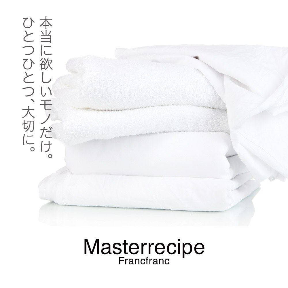
Illustrative photographs used in all Francfranc media should be appropriate to the Francfranc brand image, which conveys keywords such as "high quality", "enjoyment", "comfort", and "freedom".
In particular, avoid the use of photographs that have a vague theme without a creative structure, or illustrative photographs without visual guidance that do not focus on the object.

Ready
[Landscape]
Illustrative landscape photographs used in all Francfranc media should set us apart from other brands, avoiding images with the feeling of other brands or ones that feel clumsy. They should evoke Francfranc brand concepts, including "an inspiring, high-quality lifestyle" and "stories that suit Francfranc".
In particular, avoid the use of photographs that have a vague theme without a creative structure, or illustrative photographs without visual guidance that do not focus on the object.
Ready
[Portrait]
Portrait photographs used in all Francfranc media should be photographs that give a sense of our brand identity. Keywords would be "reliability", "leadership", "good taste", and "charming figure".
In particular, avoid the use of photographs that have a vague theme without a creative structure, or illustrative photographs without visual guidance that do not focus on the object.

Ready
[Orientation]
In a diversifying media environment, with digital signage displays and responsive auto-trimming for multi-device support and social media, we recommend shooting both landscape and portrait versions when photographing key visuals in order to promote a unified image. (Consider that the image may be trimmed to square shape in the final version).
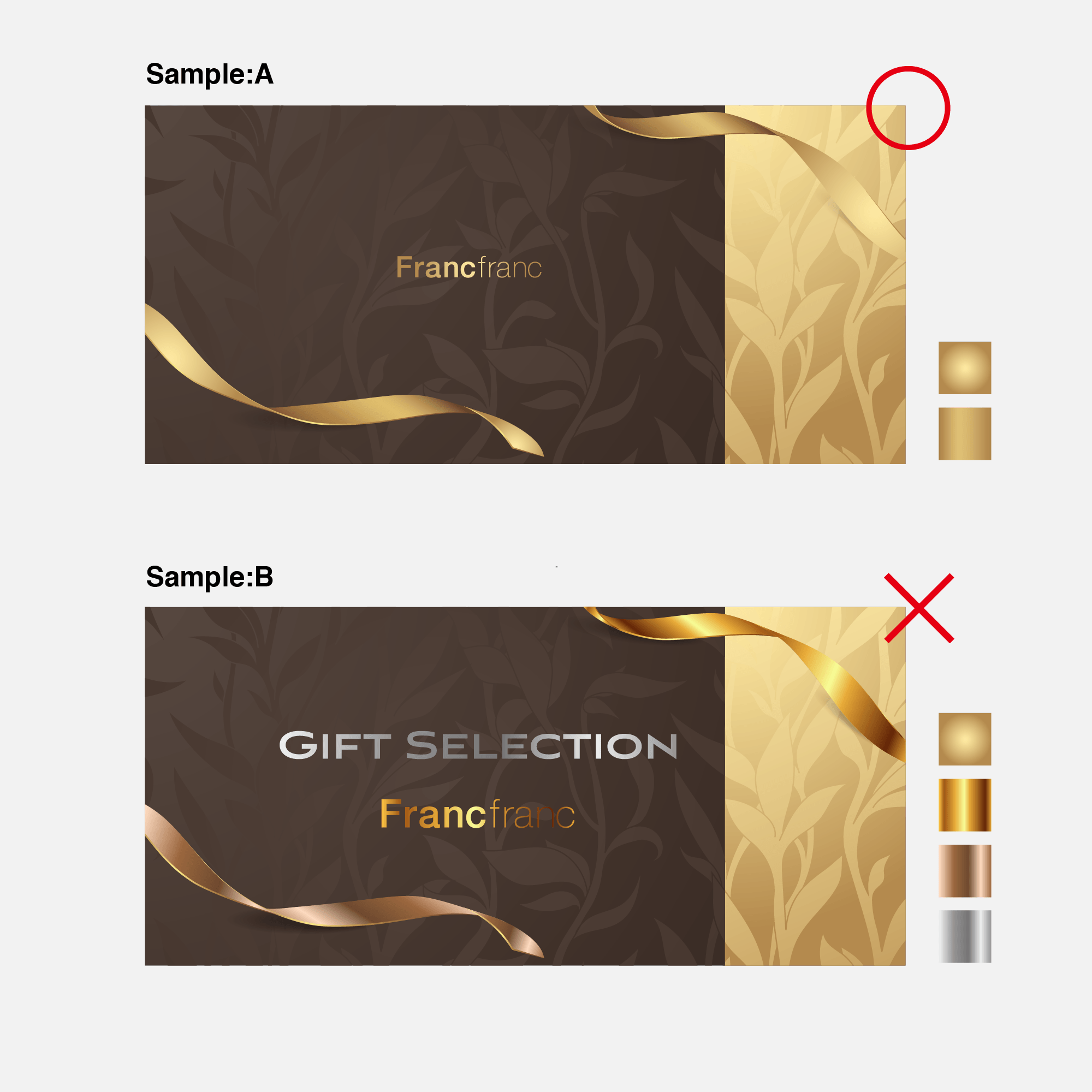
- Color palette (gold and silver)
Choose meaningful colors (when using gold and silver)
Ready
[Francfranc Gold / Francfranc Silver]
When expressing the Francfranc brand and its products with gold and silver, use refined spot colors (specified colors) appropriate for the brand in a uniform manner.
A vivid impression of abundance, quality, and style can be achieved through the use of gold.
Silver, on the other hand, can be used to communicate refined strength and a simple sense of high quality in a direct manner.
When managing the use of gold and silver, pay attention to the background color (the base color of the environment in question*) and trends, and always check with the design director and designer(s) whether use is appropriate for the Francfranc brand image.
Remember that a lack of uniformity in the use of gold and silver, with the colors jumbled together on a page, can lead to frivolous results.
- Brand Graphic Pattern
Extending the brand image with graphics
Ready
[About the use of graphics incorporating the logo as pattern]
We promote the use of graphics incorporating the logo (in the form of patterns) as a method of casually but firmly establishing the Francfranc brand image.
Simple, modern graphics combining regularity and irregularity heighten Francfranc’s brand value and originality.
Regarding use, the situation in question and the decisions of the design director and designer(s) shall take priority but, crucially, everything should always contribute to a sense of newness, fun, and an abundant lifestyle representative of Francfranc.
When logo-incorporating patterns can be replaced with other graphic patterns, use is not recommended under the design guidelines.
Style of Information Architect
- Design Elements
For functional design
Ready
[Title]
Text placed in prime positions within content involving Francfranc’s brand and product communication activities is referred to as a Title. Titles should strive for readability, visibility, and sense of design. We recommend the use of the brand font in Titles. Please refer to Typeface.

Ready
[Image]
Elements such as visuals and illustrative photographs within content involving Francfranc’s brand and product communication activities are referred to as Images. Images are indispensable, not just for inspiring the customer’s trust in the brand, but also throughout the process that leads to a purchase, evoking an appeal and brand experience which the customer cannot obtain from other brands.

Ready
[Summary]
Summary refers to the overview of the communication activities pertaining to Francfranc’s brand and product.

Ready
[Details]
Details refers to the text content that explains the details of the communication activities pertaining to Francfranc’s brand and product.

Ready
[Specification]
Specification refers to the technical specification documents for Francfranc products.

Ready
[Identity]
Identity refers to the logotypes, logos, and series names for Francfranc’s brand and products. No more than one should be displayed on any single facet of communication-related display surfaces.

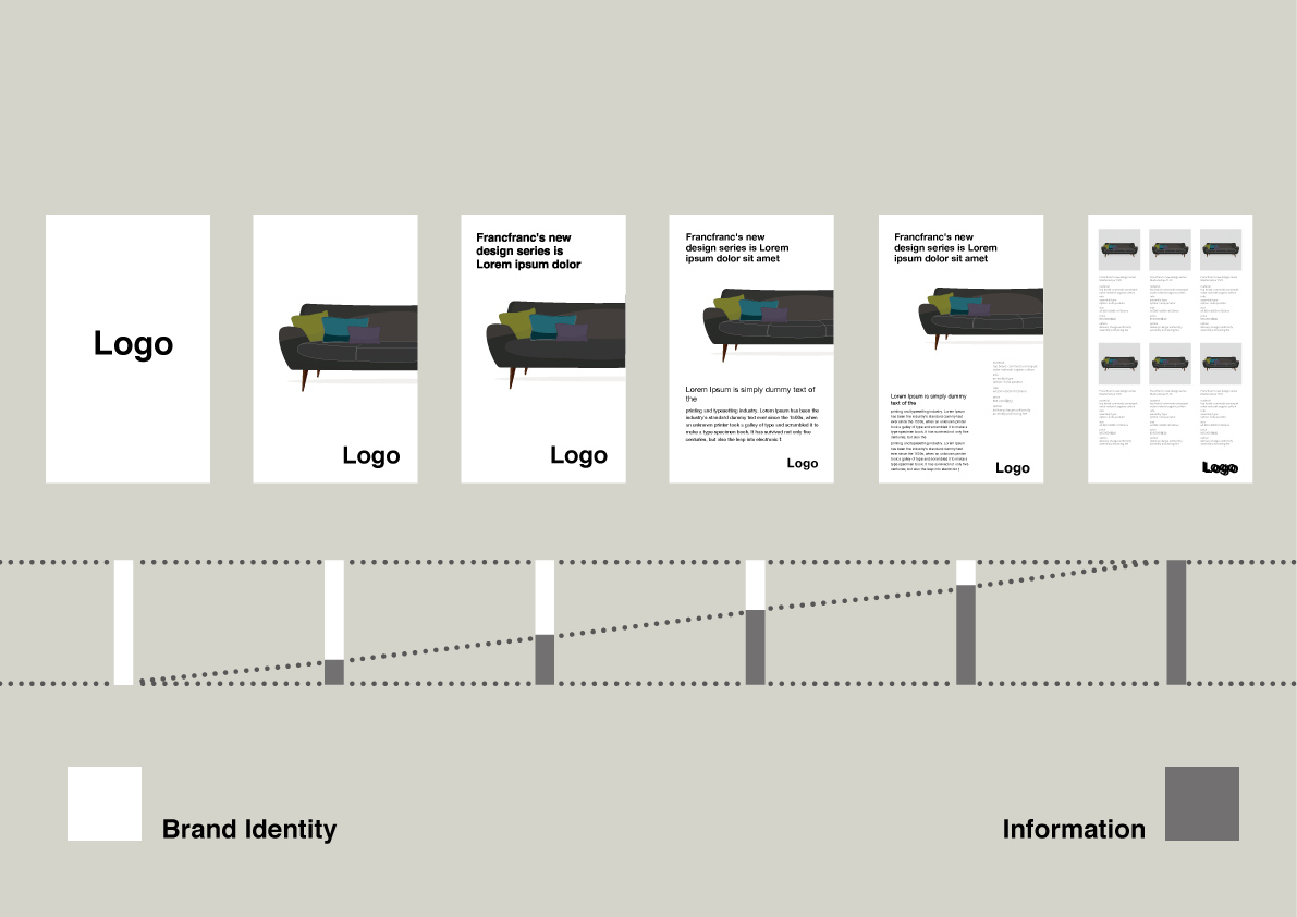
Design System of Visual Marketing
- Image Impact
A design system that displays the product in an appealing fashion
Ready
[Image Impact]
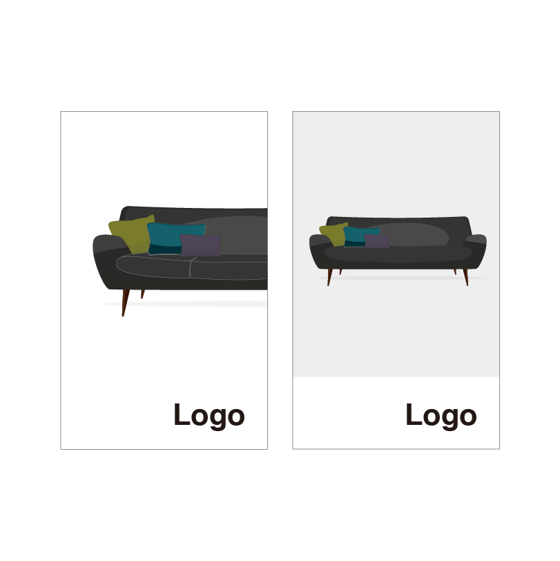
An Image Impact format is to be used when communicating the Francfranc brand to the customer. The Image Impact format is one of the simplest forms of information design, with a combination of a single visual and the brand logo.
Through a combination of an impressive Image and an appropriate Identity, displayed in a suitable space, one can promote the brand with an appealing and impactful presentation.
- Communication
A design format that simply conveys the product’s appeal
Ready
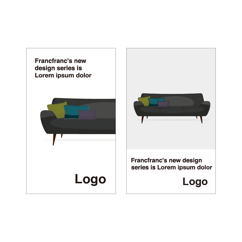
[Communication]
When you present important information that will convey Francfranc’s brand or products, it should be combined with an impressive Image surrounded by an appropriate Identity, displayed in a suitable space. Slogans and taglines will be added to this. In this situation, please consider the customer’s point of view and use slogans and taglines that will convey information without damaging the appeal of the brand.
This is a design format for communicating thoroughly with customers.
Issue
[Communication]
In products or promotional materials, we do not recommend including any careless text that weakens the impact of important Images or Identities that represent the brand or hinders the sense of design.
- Information
A design format that conveys the product’s appeal in great detail
Ready
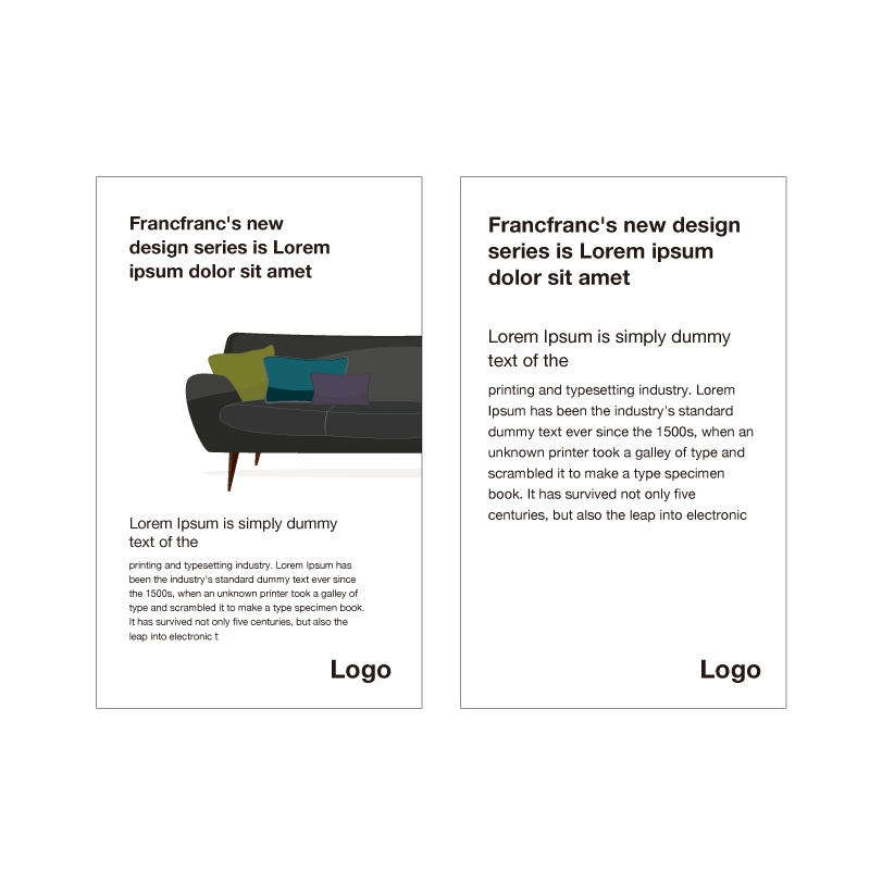
[[Information]
When communicating information about Francfranc products – when communicating from the broad strokes of the image down to the finer details – always combine an impressive Image with an appropriate Identity, displayed in a suitable space. Also add Titles such as slogans and taglines as well as a Summary (or introductory paragraph that explains product features) and Details.
Even if your materials are highly informative, keep in mind that the creative must flow, and endeavor to check the elements of your design before release so that they are all clearly performing their respective functions.
- Catalog
A design format to convey the product’s appeal and technical specifications
Ready
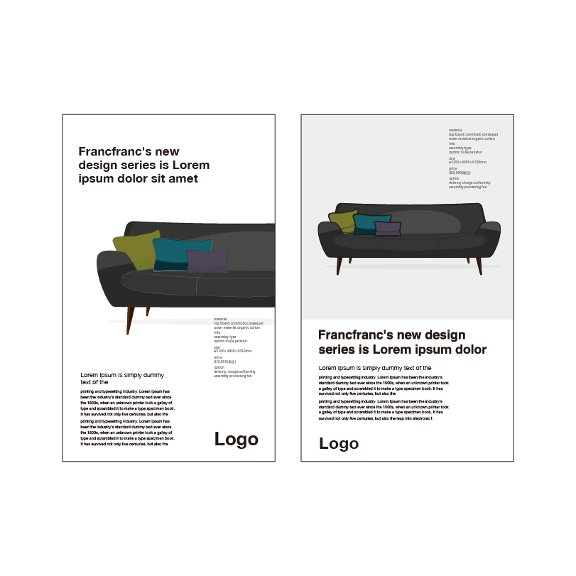
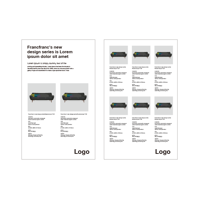
[Catalog]
When presenting important information that conveys details about Francfranc products, from their appeal to their technical specifications, you should add a Title, Summary, Details, and Specification to an impressive Image and an appropriate Identity, displayed in a suitable space. The various elements that make up a design system, including Title, Summary, Details, and Specification, should be displayed in a visible, easy-to-understand manner that makes their respective roles clear and does not harm the image of the brand or the product.
- Line up
A design format that displays a product series as a list
Ready
[Line-up]
Using the Line-up, a page on which Francfranc product series are listed, customers can learn about the features of a product line and the details of each item in it. Rather than simply listing the products, use a design that is consistent with the Francfranc brand image.
When designing detailed product information, avoid designs that deviate from this image. This means elements such as borders, underlining, or colors for emphasis.
Additionally, when using elements such as illustrated proposals for new product development, take care to create clean layouts that are both attractive and easy to understand.
- Identity
A design format that creates brand recognition
Ready
[Identity]
In order to convey a unified brand image for Francfranc, communication centered around Francfranc’s logotype is vital. Please maintain a consistent impression that does not harm the dignity of the brand, regardless of the situation. It is important that the Identity is given appropriate space within the medium it is presented in while also taking legibility into consideration.
Application
- Business environment
The application of design guidelines in a business environment
Ready
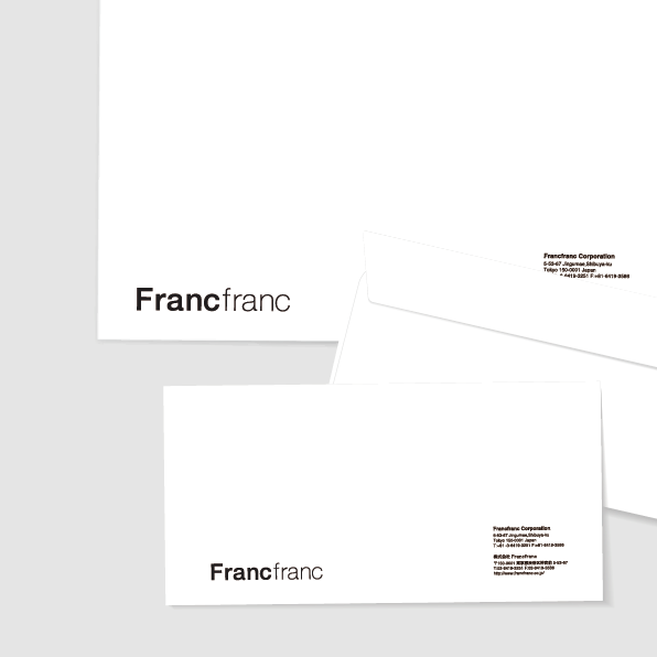
[Envelopes and Other Supplies]
To accurately convey the Francfranc brand image, a simple and refined presentation focused on typesetting with Francfranc’s logotype and brand font is important. Please be sure to preserve a suitable space appropriate for the medium in question to avoid harming the Francfranc brand image.
Ready
[PowerPoint Templates etc.]
For the creation of Francfranc presentation materials to be used in business settings (such as new product development or for planning proposals), we recommend a simple and stylish presentation focused on typesetting with the Francfranc logotype and brand font. Please be sure to protect the Francfranc brand image and preserve a suitable space appropriate for the medium in question.
- Sales promotion environment
Sample of the application of design guidelines
Ready
[Design Samples (Communication) for Point of Purchase Displays etc.]
To accurately impart the Francfranc brand image, it is important to have a simple and stylish presentation focused around typesetting with Francfranc’s logotype and brand font. Please be sure to preserve a suitable sense of space depending on the medium of display to avoid harming the sense of quality and freshness in the Francfranc brand.
WIP
[Development of Graphic Elements]
To accurately convey Francfranc’s brand image, a design focused on Francfranc’s logotype is important. Because these can rapidly pass checks such as those regarding intellectual property, they are effective for global deployment and rapid product development. To attractively and correctly convey the image of the brand, the development of graphic elements using Francfranc’s logotype will continue hereafter.
- Social media application situations
Photography sample for communication via social media
Ready
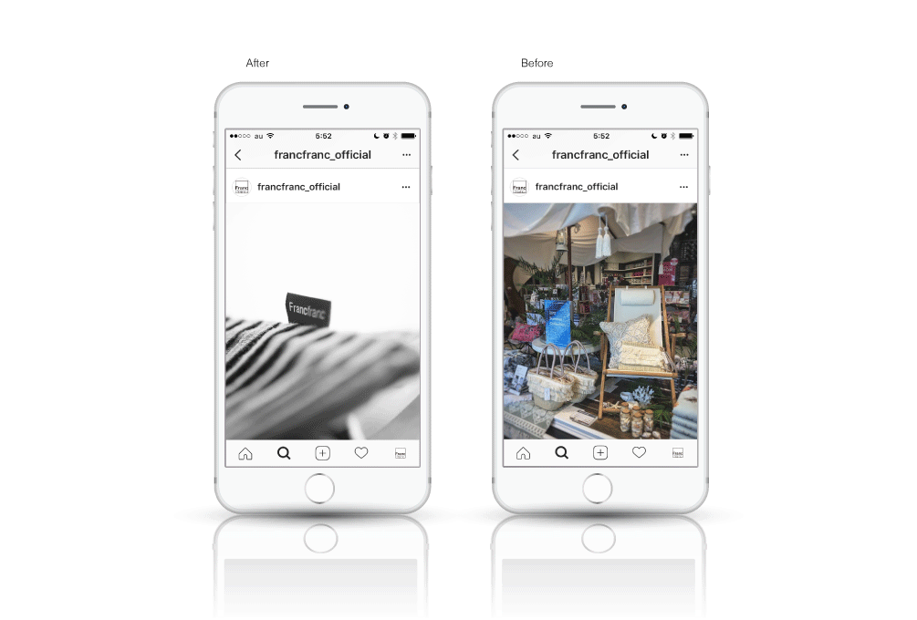
[Communication Via Social Media]
To convey Francfranc’s store interiors and products in an impressive manner, it is important to focus on the products. In terms of leading and supporting roles, the products should stand out in the leading role. For communication on social media, please consider composition and gradation, and use images that clearly convey the intended message. The example on the left has a composition which pulls the gaze. The sample on the right, however, has a composition in which it is difficult to tell which is the leading product and therefore difficult to envision the worldview of Francfranc.
- Graphic design
About improving quality in graphic design
Ready
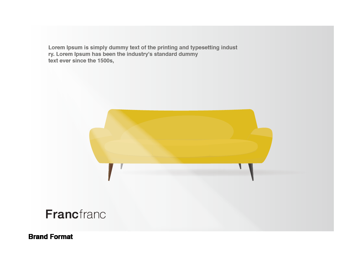
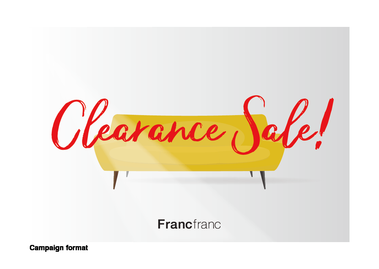
[Brand Format and Campaign Format]
A simple and minimal design format using brand fonts in text style is called a Brand Format.
A layout using non-brand fonts for a specific purpose is called a Campaign Format.
The design director is to control that the Campaign Format, which can make for a catchy visual expression precisely because it is special and out of the ordinary, is not used more often than the standard form of expression, i.e. the Brand Format.
In order to maximize the impact of advertising, creative assets should always be focused on maximizing productivity and cost-effectiveness.
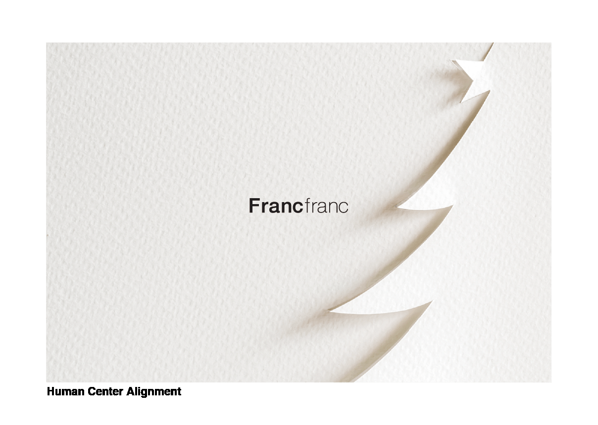
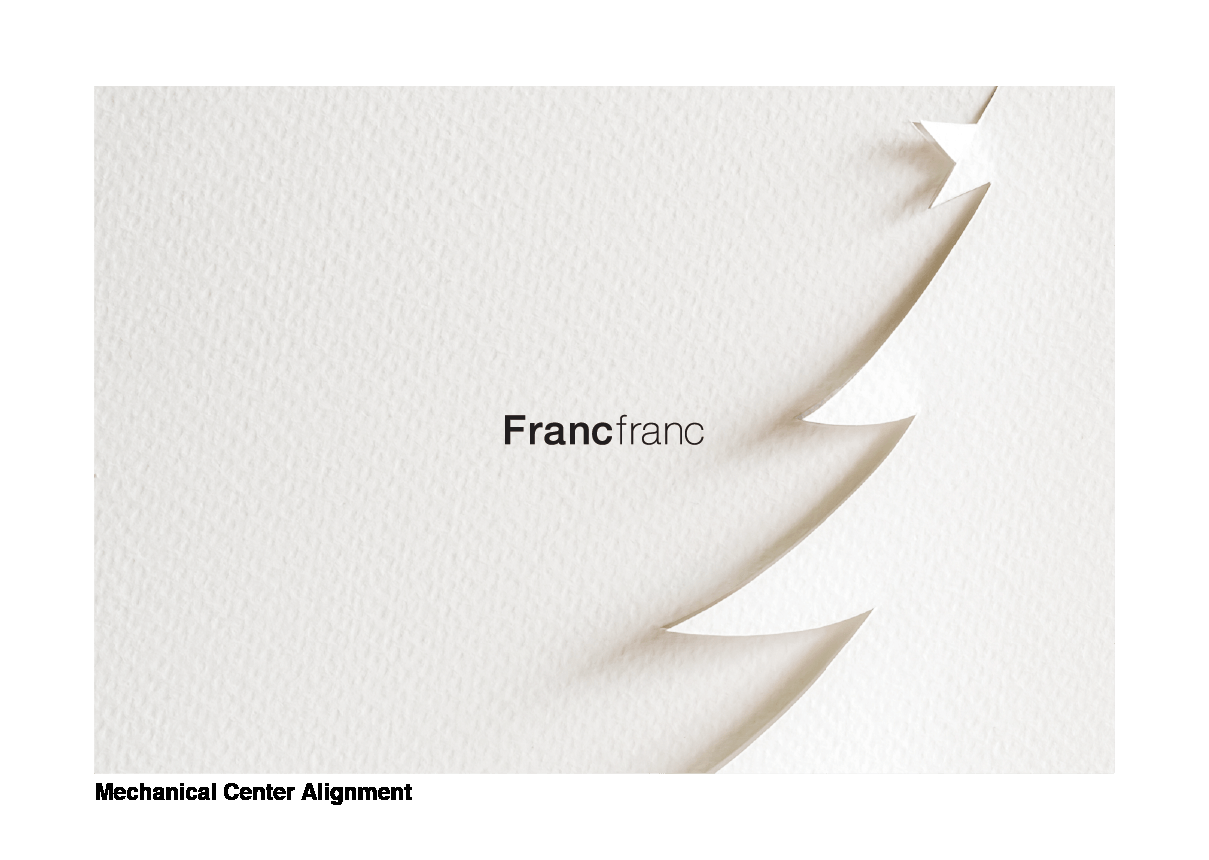
Ready
[Mechanical centering and visual centering]
Francfranc brand tools put a premium on high-quality layouts.
Particularly careful attention is to be paid to the placement of the brand logo.
In cases such as this example, an optical illusion may lead to a mechanically centered element appearing below center, making the result appear off balance.
In order to protect the Francfranc brand image, the design director and designer(s) are to conduct checks with full-scale samples reminiscent of the final product, and place the brand logo so that an ideal balance is achieved.
Ready
[Inserting attractive shadows]
When communicating the Francfranc brand and its products, visibility is of course a prime consideration. You should also avoid the thoughtless use of text bordering and shadows that lack consideration of attractiveness aspects.
- Catalog and brochure
Quality improvement in design that includes editorial elements
Ready
[Treasuring the brand image]
Treasure Francfranc’s brand image in all print media used to communicate information about the Francfranc brand or its products, including brochures and flyers.
When displaying the brand logo, adhere to the logo manual and maintain correct isolation.
Ready
[Content should be easy to read and understand]
Functional styles and attractive character sets, including titles, introductory text, and body text, are to be used in the layout of all print media, including brochures and flyers, used to communicate information about the Francfranc brand or its products.
Decorative lines and symbols for indicating bullet points are to be kept to a minimum, but high-quality photos and graphics matching the body text and the theme should be given sufficient space in the placement.
Strive for a “Francfranc-esque” approach throughout.
- Web Design (Digital Media Design)
Guidelines for accessible content design
Ready
[Multi-device functionality]
The design for websites and other digital media featuring the Francfranc brand and its products should take into account various user environments. Content should be designed to be viewable on a wide range of devices, not only on personal computers, smartphones and digital signage.
Avoid focusing too heavily on customizing site décor and features, as such elements may make necessary design updates difficult to carry out.
Ready
[Examination of content]
When designing websites and other digital media featuring the Francfranc brand and its products, aim for a design that displays the featured content in a pleasant manner to the maximum number of users.
Also, in order to allow for pleasant viewing of products and other content, aim for maximum display performance, i.e. minimal load and other waiting times, by taking steps such as reducing the size of image files.
Ready
[Improving accessibility]
Aim to improve the accessibility of websites and other digital media featuring the Francfranc brand and its products by taking into account various connection environments, display devices, and the diversity of users viewing the site or media in question.